Typography and Design
Typography plays an important role when designing, not only for the web. It’s most important for sites like blogs, where users are reading almost all the time.
When writing the design for my blog, I already had in mind that font-size, line-height and width of the lines are important. I increased the default line height to 180% and gave all headings more whitespace for better readability.
What I didn’t have in mind is how they relate to each other. The wider the lines are, the higher the lines should be. This ensures readers find the next line when they return to the beginning from the previous line. You can read more about the golden ratio in typography in the blog post by Chris Pearson.
After reading that post, I started redesigning my blog. You can see the result live. Below is a comparison of the old vs. new design.
Previously, I used Lato as font for my blog, a sans-serif font type. Personally, I prefer serif font types for longer texts, because I find it more readable. I switched to Bitter, which is available on Google Fonts. There’s an interesting blog post, if you want to read more about serif vs. sans-serif fonts.
I made the font a little larger and most importantly reduced the line width. I used the Golden Ratio Typography Calculator with font size set to 15px and content width set to 700px. There were four suggestions, I tried all and chose the one that I liked best.
I also removed the dark background. I thought it’s good to have a dark background, so it’s easy to focus on the content. But actually, it’s way more distracting than a white background without any borders or shadows.
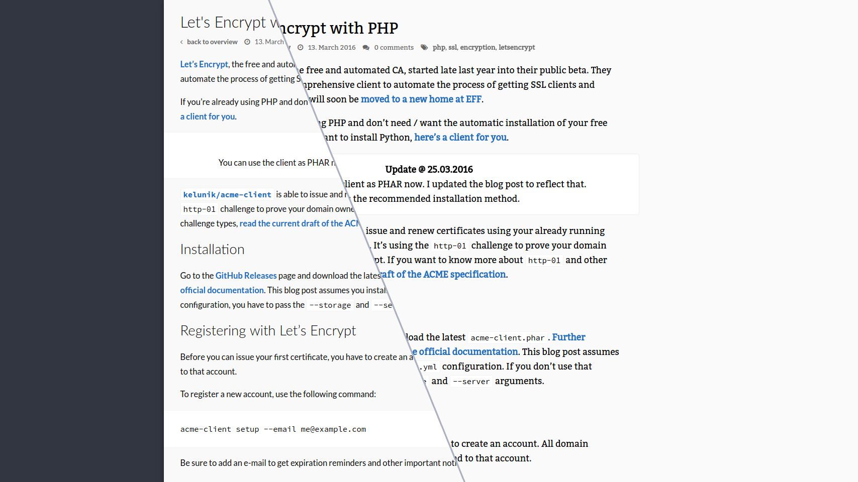
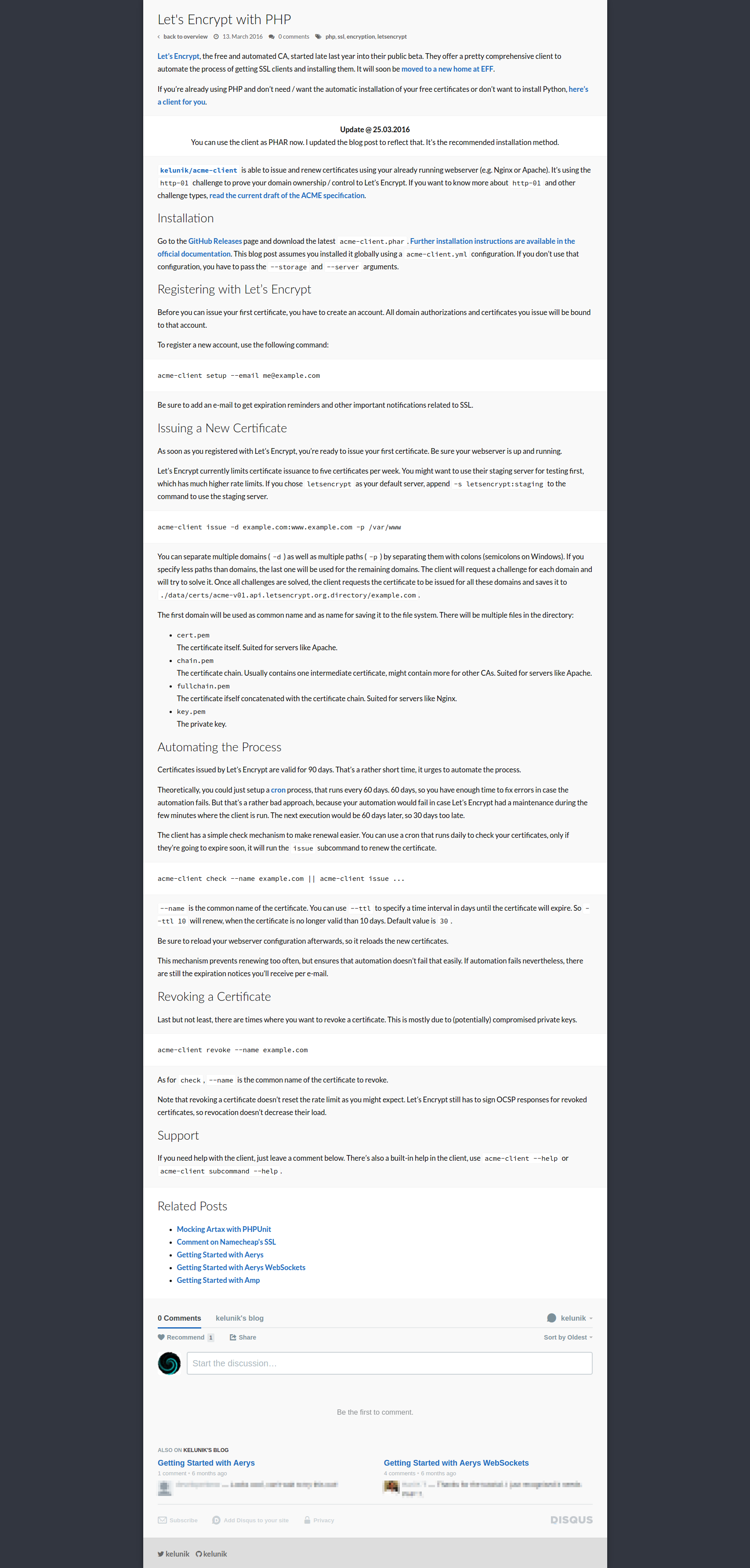
Below you can see a direct comparison of the old and new design for my blog post about Namecheap.
 |
 |
As you can see, the page got a little longer, so more scrolling is required to read the full post. But I think that’s acceptable if the post itself is more readable. Actually, I expected it to even grow more in length, given that I increased the font size, reduced the line width and kept the line spacing about the same. Especially the quote should be more readable now.
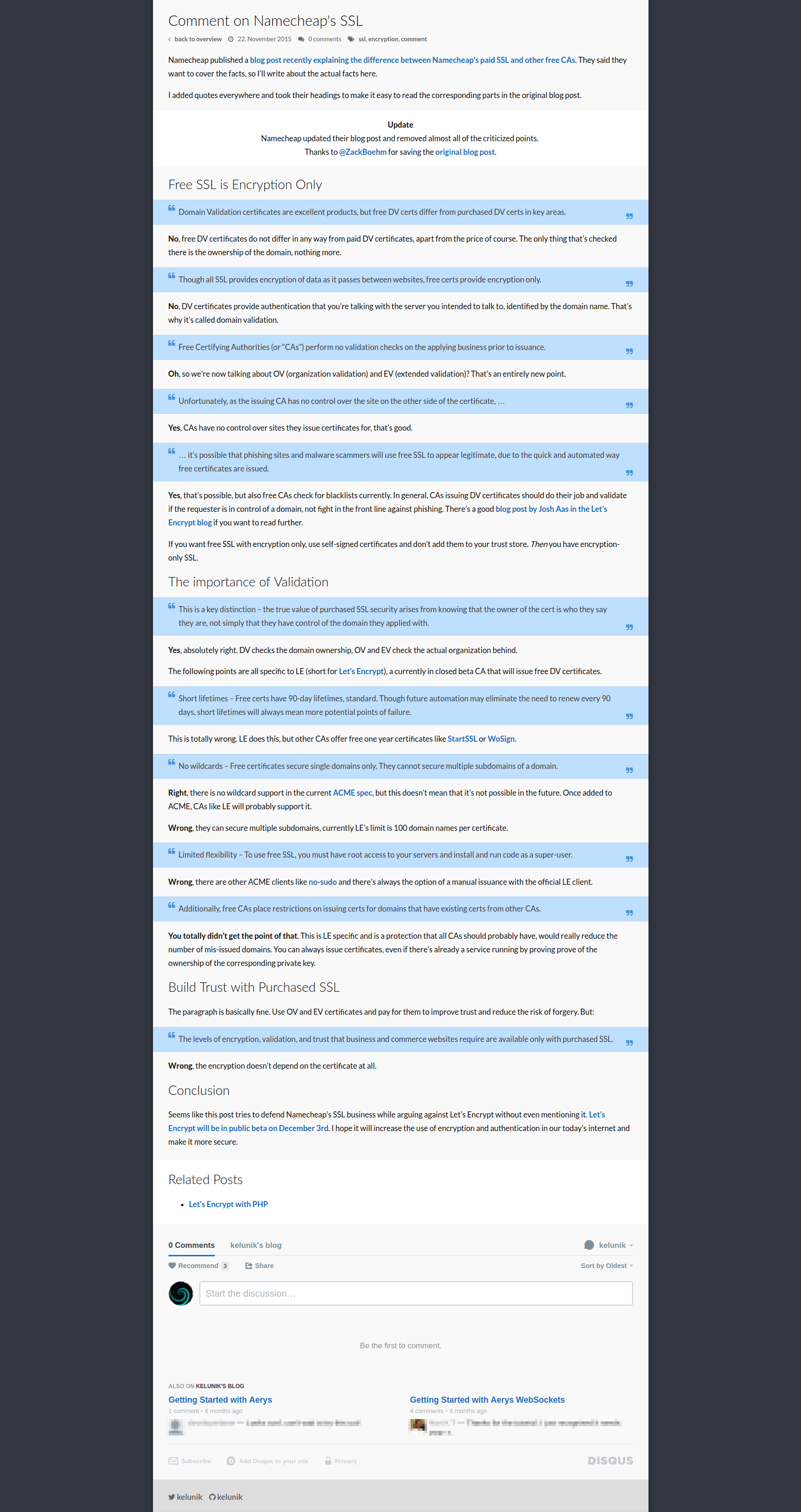
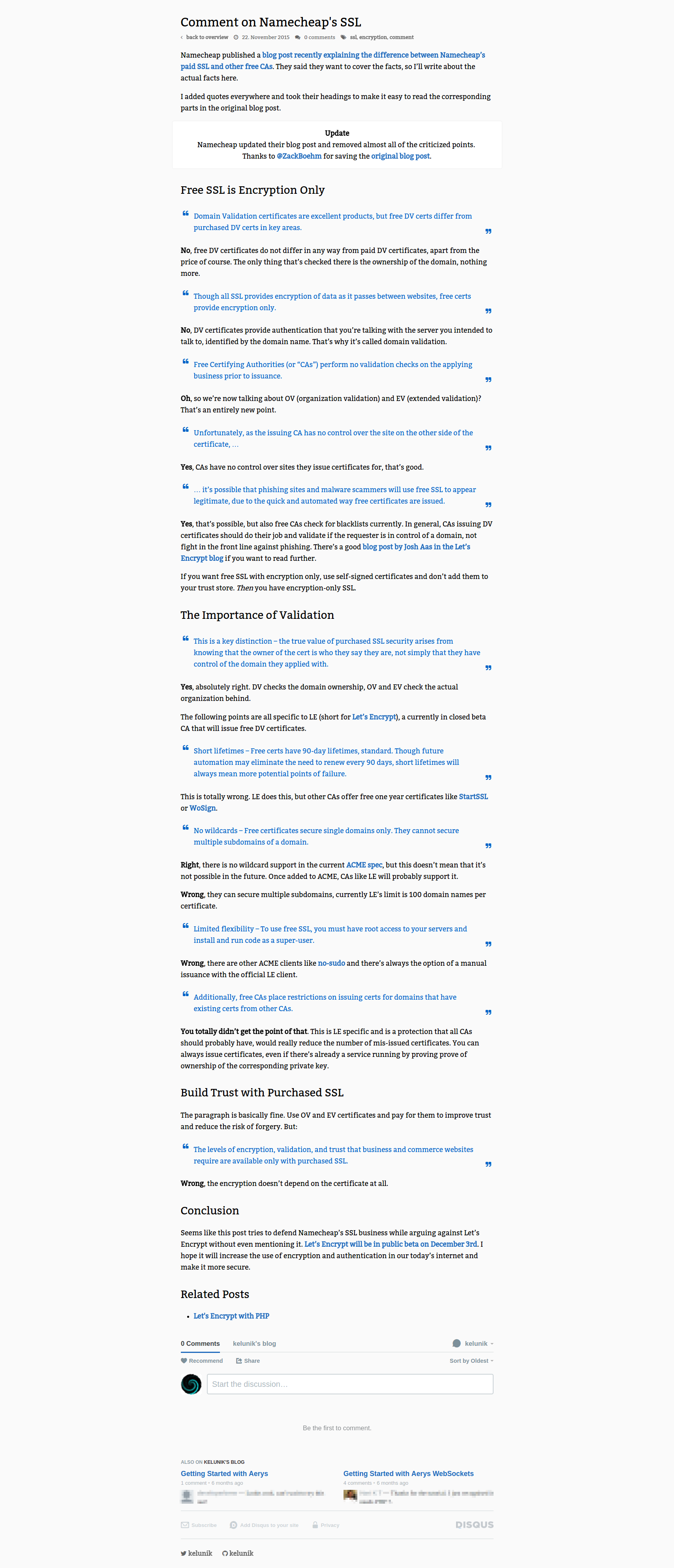
As another example, there’s the post about Let’s Encrypt.
 |
 |
I hope you find this post useful. There are some blogs I really enjoy reading, but others where I even open the browser’s dev-tools to make them more readable. If you create content, think about typography, color and layout of your content, it’s about as important as your actual content.
Feedback is very welcome and important. You’re reading the the blog posts, so you should feel comfortable with the layout, colors and typography. And the content itself of course.